Architecture Studio
Projects
Journal
Studio
Contact
Projects
Journal
Studio
Contact
No-Brainer
Upside Down
Hiring
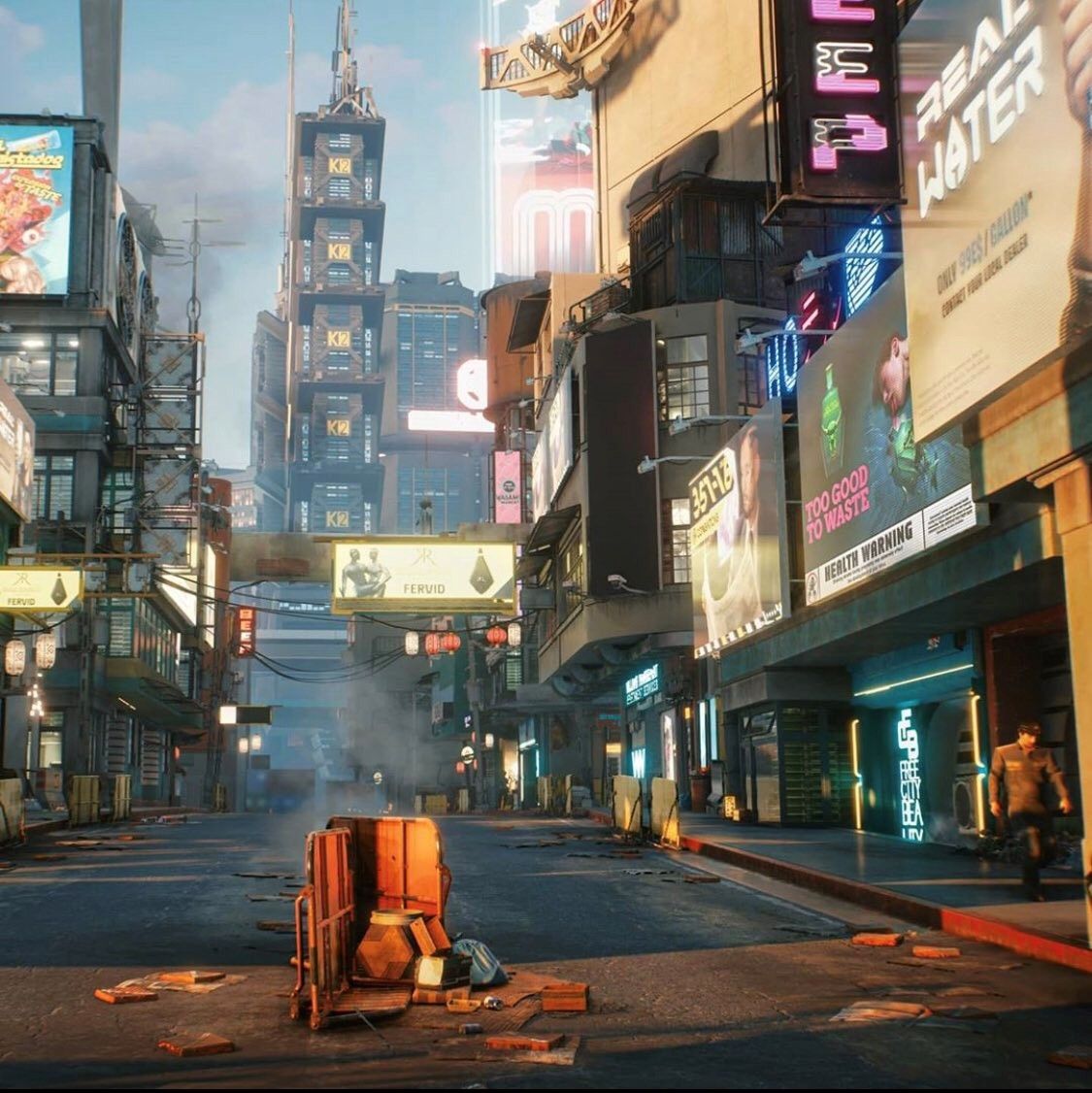
Cyberpunk 2077
Ups and downs
The Chadar
Learning from Nairobi
The Darker Half
Digital Space
Spicing Up
Prefabs
The Charpai
The Off Grid Jewel
Rediscovering Sketching
The Melting Pavilion
Ornament & Grime
The Daylight Factor
The Bioclimatic Design
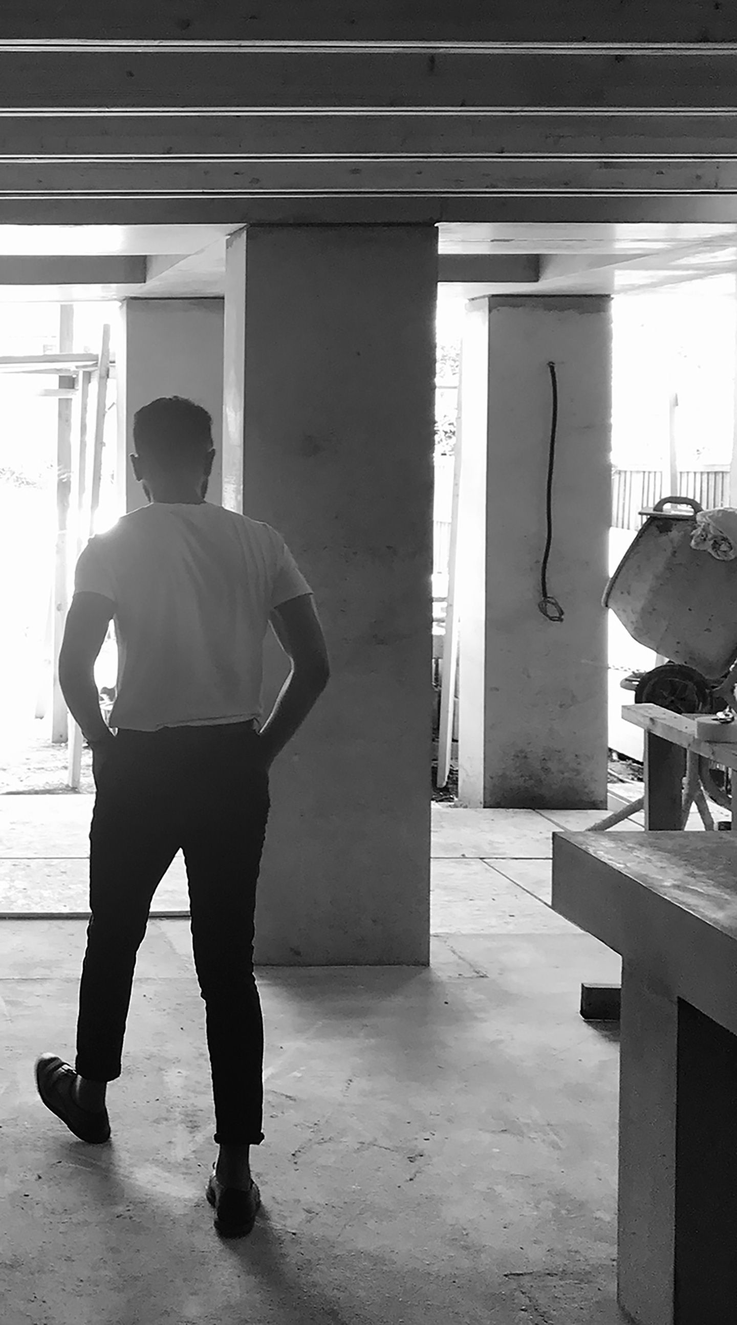
The Concrete Pavilion
The Hierarchy of Buildings
The Purpose of Writing
The Millennial Villa
The Machine for Living
The Anodyne Architecture
Subscribe for stories
from our Journal